


Most gym owners already know their member experience leaks somewhere. The problem is nobody can tell you where with any confidence. Front desk thinks it's the billing emails. Trainers think it's class availability. The owner thinks it's the onboarding gap. Everyone's partly right, which is exactly why nothing gets fixed — you can't prioritize six competing hunches.
A member touchpoint value map fixes that by forcing every interaction onto the same grid: how much revenue or churn risk it carries, versus how expensive it is to improve. Once you've scored your touchpoints that way, the top three usually jump out clearly enough that the arguments stop. This post walks through how to build the scoring matrix, how to read it, and how to turn the top three into a 30-day automation roadmap with ROI you can actually defend to yourself.
Why ranking touchpoints beats "improving the member experience"
"Improve the member experience" sounds great and changes nothing. There are easily 25–30 distinct touchpoints in a single-site gym — from the first inquiry reply, to the 48-hour post-join check-in, to the awkward moment a card declines, to the email nobody opens after a member stops showing up.
Treating them equally is the core mistake. In real operations, a handful of touchpoints carry most of the revenue and churn weight, and the rest barely move the needle no matter how polished they are. A gym can spend three weeks rewriting its welcome email sequence while the failed-payment follow-up — the thing quietly bleeding $600–$900 a month — sits untouched because it's boring and nobody owns it.
That's the whole job of the value map: stop optimizing the visible stuff and ignoring the expensive stuff.
The two axes that actually matter
You only need two scores per touchpoint. People try to add five dimensions and it collapses into a spreadsheet nobody updates. Keep it to impact and cost-to-improve.
End appointment chaos and boost attendance.
Gymioly streamlines booking, confirms sessions, and manages memberships effortlessly.
- Unified class and membership management
- Automated member notifications
- Trainer scheduling and availability
No credit card required
Impact is a blend of two things:
-
Revenue exposure — how much money flows through or depends on this moment (new joins, upsells, renewals, at-risk saves).
-
Churn risk — how likely a bad version of this touchpoint is to push someone toward canceling.
Score each from 1–5, then combine. Keep it simple: Impact = (Revenue exposure + Churn risk), so it lands between 2 and 10.
Cost-to-improve is the honest effort to make the touchpoint reliably good — staff time, tooling, complexity, and how much it depends on a human remembering to do it. Score 1 (trivial) to 5 (painful). Touchpoints that depend on a human remembering something should always score higher on cost, because "remember to text the no-show" is not a system, it's a wish.
Here's a stripped-down version of what a filled-in matrix looks like for a typical single-location gym:
| Touchpoint | Revenue exposure (1–5) | Churn risk (1–5) | Impact (2–10) | Cost-to-improve (1–5) | Priority (Impact ÷ Cost) |
|---|---|---|---|---|---|
| Failed-payment recovery | 5 | 4 | 9 | 2 | 4.5 |
| 48-hour post-join check-in | 3 | 5 | 8 | 2 | 4.0 |
| Class no-show / late cancel | 3 | 4 | 7 | 2 | 3.5 |
| Lapsed-attendance outreach | 4 | 5 | 9 | 3 | 3.0 |
| Membership freeze request | 4 | 3 | 7 | 3 | 2.3 |
| Renewal / annual review | 4 | 3 | 7 | 4 | 1.8 |
| Welcome email polish | 2 | 2 | 4 | 2 | 2.0 |
| Birthday / anniversary note | 1 | 2 | 3 | 3 | 1.0 |
The Priority column (Impact ÷ Cost) is the part people skip and shouldn't. It rewards touchpoints that are high-impact and cheap to fix. The birthday note is warm, nice, and almost worthless as a priority. Meanwhile failed-payment recovery scores high impact and low cost, which is exactly why it's the top candidate even though it's the least glamorous thing on the list.
A note on scoring honestly
The whole thing falls apart if you inflate revenue exposure to justify a project you already wanted to do. A good gut-check: if a touchpoint's revenue exposure is a 5, you should be able to point to the actual dollars moving through it in a given month. If you can't, it's probably a 3. Your measurables hierarchy and dashboards are where you pull those numbers from — if you don't have them yet, build that first, because scoring without data is just ranking opinions.
How to actually build your map in one sitting
This takes about 90 minutes if you don't overthink it.
-
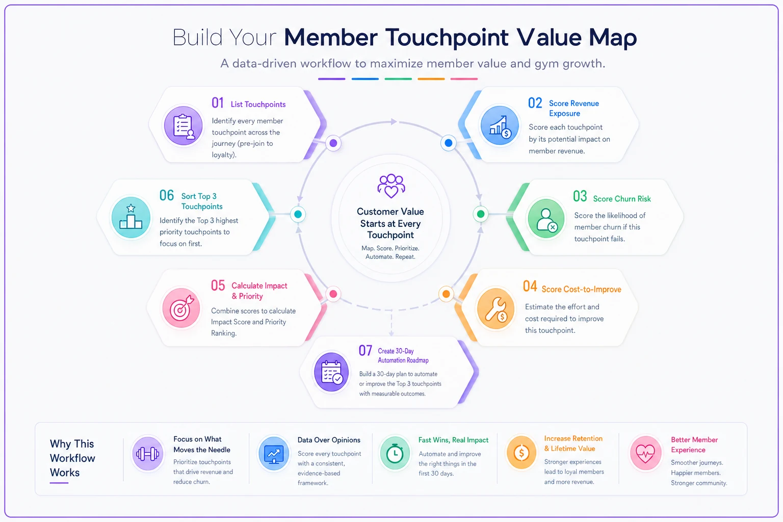
List every touchpoint. Walk the member lifecycle start to finish — inquiry, trial, join, first two weeks, steady state, at-risk, cancel, win-back. Write down every automated or manual interaction. Most gyms land around 25–30.
-
Score revenue exposure. For each, ask
how much money is directly tied to this going well? Pull real figures where you can.
-
Score churn risk. Ask
if this moment is handled badly, how likely is it to contribute to a cancellation? Be honest about the painful ones.
-
Score cost-to-improve. Add weight to anything that depends on a human remembering to act.
-
Calculate Impact and Priority. Impact = revenue + churn. Priority = Impact ÷ Cost.
-
Sort by Priority, descending. Your top three are now staring at you.
-
Sanity-check the top three. Do they feel right operationally? If something obvious is missing, your scoring was probably too generous elsewhere — revisit, don't override.
The discipline here is resisting the urge to manually promote your pet project to the top. If renewal reviews ranked seventh, they ranked seventh. That's information.
A quick workflow visualization can help.
The discipline here is resisting the urge to manually promote your pet project to the top. If renewal reviews ranked seventh, they ranked seventh. That's information.
The 30-day roadmap: automate the top three, not all thirty
Once you've got your top three, the trap is trying to fix everything at once. Thirty days, three flows, done. Here's a realistic cadence using the example matrix above, where failed-payment recovery, the post-join check-in, and class no-show handling came out on top.
Days 1–10 — Flow #1: Failed-payment recovery This goes first because it's pure recovered revenue with almost no churn downside if handled gently. Map the sequence: card declines → same-day soft notice → day 3 reminder with a one-tap update link → day 7 escalation → day 10 personal follow-up from staff. The point of automating it is that it fires every single time, instead of whenever someone notices the failed charge report. Human memory is the leak; the sequence plugs it.
Days 11–20 — Flow #2: 48-hour post-join check-in New members decide whether this was a good decision in the first two weeks, which is why this touchpoint carries such high churn risk. Automate a check-in at the 48-hour mark that's actually useful — "did your first session go okay, need help booking your next one?" — and route any non-response or negative reply to a staff member. This pairs directly with your 14-day onboarding sequence; the check-in is the safety net that catches people the milestone emails miss.
Start with the money-recovery flow to build credibility quickly.
Days 21–30 — Flow #3: Class no-show and late-cancel handling Automate the reminder cadence and the waitlist backfill so empty spots get offered to someone instead of sitting dead. Lower revenue per incident but high frequency, so the compounding effect matters across a month.
The sequencing logic: money-recovery first (fast, visible ROI that buys you internal buy-in), retention second (highest churn stakes), frequency and efficiency third.
A worked ROI example
Take a gym with roughly 480 members, average dues around $55/month.
Failed-payment recovery, before: card declines happen on maybe 4–5% of charges monthly — call it around 22 failed payments. Staff catches and recovers maybe half of them, late, which means roughly 10–11 memberships slip into cancellation or drawn-out limbo each month. At $55 that's somewhere around $600 in monthly recurring revenue walking out the door, plus the compounding loss since those members won't renew either.
After automating the sequence: recovery rates on consistent, gentle dunning flows typically climb to the 70–80% range because the member just needed a frictionless way to update their card and a nudge that actually arrived on time. Recovering an extra 5–6 memberships a month is roughly $300–$350 in recovered MRR, which annualizes to something in the $3.5k–$4k range — from one flow that cost almost nothing to build because the scoring showed it was cheap to improve.
Stack the post-join check-in on top of that and the combined return on a 30-day sprint usually lands well above whatever the tooling costs. That's the whole point of the Priority ratio — you went after the cheap, high-impact wins first, so payback shows up inside the first month instead of next quarter.
Where automation genuinely helps — and where it doesn't
Automation is the right tool for touchpoints that are high-frequency, time-sensitive, and dependent on someone remembering. Failed payments, check-ins, no-show reminders, lapsed-attendance nudges — these are perfect fits, because the failure mode is always "we meant to but got busy." A workflow platform that fires these on triggers removes the single biggest leak, which is inconsistency.
Where it doesn't help: touchpoints that scored high on churn risk specifically because they need a human. A member calling to cancel after a bad experience does not want an automated save sequence — that makes it worse. The map should route those to a person, fast, not try to automate the empathy out of them.
A useful rule from watching how these sprints play out: automate the trigger and the routing, keep the human on the judgment. The system should notice the at-risk signal and put it in front of the right staff member with context attached — not pretend to handle the conversation itself.
When building a value map is a bad idea
If you don't have clean data yet. Scoring revenue exposure off guesses produces a confident-looking ranking built on sand. Fix your measurables first.
-
If you don't have clean data yet. Scoring revenue exposure off guesses produces a confident-looking ranking built on sand. Fix your measurables first.
-
If you're pre-100 members. At that size you know every member by name; a formal matrix is overhead you don't need. Just talk to people.
-
If you'll build the map and not act on it. A scored matrix that sits in a Google Sheet is worse than nothing, because now you know where the money's leaking and chose not to fix it.
If you'll build the map and not act on it. A scored matrix that sits in a Google Sheet is worse than nothing, because now you know where the money's leaking and chose not to fix it.
Real scenario
A single-location strength gym, around 420 members, kept losing people in month two and couldn't figure out why — the owner assumed it was programming. Building the value map put the 48-hour post-join check-in and failed-payment recovery at the top, well ahead of the class-schedule changes everyone had been debating.
They ran the 30-day roadmap. Failed-payment recovery got automated first and pulled recovery rates from roughly half to around three-quarters within a month. The post-join check-in — automated trigger, human follow-up on anything that smelled off — caught a handful of new members each week who were quietly drifting. Nothing dramatic happened overnight. But over the following quarter, new-member month-two retention noticeably improved, and the recovered billing alone paid for the whole effort several times over. The schedule changes they'd argued about for weeks? Still haven't touched them. Turned out they didn't matter much.
Bringing it together
Most gyms can't fix their member experience not because of effort but because they're spreading that effort evenly across touchpoints that are wildly unequal in value. A member touchpoint value map replaces the arguing with a ranked list, and the Impact-÷-Cost score consistently surfaces the unglamorous, high-return flows that owners tend to deprioritize precisely because they're boring.
Build the map in one sitting, trust the ranking even when it points somewhere you didn't expect, and automate the top three over 30 days — money-recovery first, retention second, efficiency third. Keep the humans on the moments that need them. Do that, and you stop guessing about where your experience leaks and start fixing the parts that actually move revenue and churn.
Ready to elevate your gym operations?
Join 2,000+ gyms using Gymioly to reduce admin overhead, improve member experience, and grow revenue.